
MKN Bemanning AB
Visual Identity
MKN Bemanning is a staffing company that activates within the construction industry. They offer a diverse range of construction services like renovation demolitions for different types of buildings. They work with both private and business clients within the region.
The goals was to create a logo that visually represented their strong and reliable personality as well as to emphasise the idea of construction and buildings.
As their business is focused on work within all types of buildings, the idea for the logo was to use the shape of the initials and create the from of a house as well as suggest the sense of demolition through the fragmented parts.

The colour palette is neutral, referring to the concrete used in the construction industry. The black and bold type gives the logo a strong presence and creates a reliable and trustworthy presence needed in this industry.
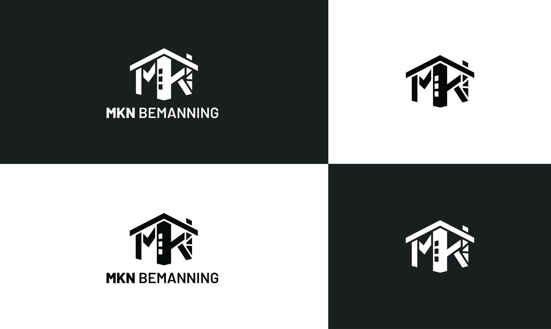
The logo comes in three dynamic variants, working perfectly for the client as it changes size and shape based on the required context.


